
Hello, music lover! It’s great to see you here. Whether you’re a beginner or an experienced user of our tools, you’re sure to find something new on this page!
This manual will guide you through the design steps and introduce you to our powerful design tool.
Looking for a quick tutorial? Then you can have a look at this page:
Note: This manual is only for the design phase. To learn more about the Configurator, your controller, or the MIDILLI Account, please refer to the following manuals:
If you’d like to dive in and experience it for yourself, or follow along as you read, click below to get started:
The first start may take a bit longer, but don’t worry—the progress bar will keep you updated on… well… the progress.
Please note that the Factory is designed exclusively for desktop devices and will not work on mobile devices.
Features
Did we mention that the tool is powerful? If we did, we’re pretty sure we haven’t shown you the full list of customization options it offers. Below is a quick list of features, each of which is also covered in the manual. Here’s what you can expect—though we might have even missed something. Feel free to experiment and discover more on your own!
Generic features
These features are general characteristics related to your controller’s physical appearance, dimensions, and the available customizations for the controller itself:
- Choose the casing for your MIDI controller from a variety of options: FSC-certified wood or eco-friendly PLA available in different colors and as glow-in-the-dark version.

- Define the size of your controller: You’re not limited to just small, medium, or large. You can customize the size in 5 cm increments, ensuring it fits perfectly on your desk, in your bag, or on any shelf. Sizes range from a minimum of 10×10 cm to a maximum of 40×40 cm.

- Choose or upload a design image for the top side of your controller to make it truly yours. You can also select between a matte or glossy finish.

- Customize your controller with your own brand. Display your chosen name when you plug it in—on its own display, computers, mobile devices, and in DAW software.
- Add a logo that will appear at startup if you choose to include a screen on the controller. Simply select your logo, and we’ll make it happen.
- Place components anywhere on the controller, not just on the top side. Use grids to align them, and receive real-time feedback if your design isn’t optimal.
- Want to stay within your budget? Check the real-time cost of each component and branding option as you customize:

Component types
Interfaces
Currently, MIDILLI Controllers provide and use USB-C interface for both power and communication with your computer or mobile device by default. You can also enable Bluetooth interface to connect up to two devices simultaneously. If you have Bluetooth option, the USB-C interface will still be required, but only for powering up your controller.
Inputs
- DIN 5 MIDI In: Forward incoming MIDI messages to the computer or to another MIDI output.
Outputs
Each output can be disabled and re-enabled in the Configurator if desired.
- MIDI Thru: Directly forward MIDI input to another device via its MIDI interface. You can add up to two Midi Thru interfaces. Note that MIDI Thru needs MIDI In to be added since it is a physical hardware connection.
- MIDI Out: In addition to the USB-C interface and optional Bluetooth interface, send MIDI messages from the controller, Bluetooth MIDI, or MIDI input to the MIDI out. Up to 4 MIDI outs can be added, either individually or in combination, in one of the following types:
- DIN-5: Standard MIDI DIN-5 jack
- 3.5 mm Jack Type-A
- 3.5 mm Jack Type-B
Control Elements
You can have up to 80 control elements. They can send CC and/or Note On/Off messages, or can be used to change banks of the controller to increase the number of controllable elements.
- Potentiometers: Finite rotation elements, ideal for adjusting volume, filter settings, and other continuous parameters.
- Faders: Functionally similar to potentiometers but operate with a sliding motion instead of rotation. Available in 45mm and 60mm sizes.
- Buttons: Send on/off messages and enable simple automation tasks. Choose between standard push buttons (without LEDs) or LED-equipped ones. The LED color can be customized during configuration. Note: The MIDILLI Button is mandatory and provided free of charge. If you forget to add it, you will be prompted to place it, as it is required for diagnostics when needed.
Screens
View messages being sent, your brand name, and logo. Available in two monochrome color options and two sizes:
- Blue/Black: 0.91” or 0.96” (128×32 or 128×64 pixels) sizes
- White/Black: 0.91” or 0.96” (128×32 or 128×64 pixels) sizes
Cosmetics
Make fine touches with cosmetic elements. Currently we support custom text on anywhere if you using a wood design, or on the surface if custom design image is selected.
Place it, edit it, change size and more…
Component customizations
- Choose how the control elements should look by selecting a cap. You can choose one at a time or select multiple.
- Set the text for the control elements to be displayed both on the controller screen and on the physical controller itself1.
- Customize the size of the text1.
- If you opt for a custom design image, adjust the color to be printed on the controller, as well as the background color of the text and corner detail. See an example below:

A knob with ‘blue drop’ cap, a white-colored custom text, and black background with rounded corners.
1) If you choose a plastic casing and do not opt for the custom design image option, the text cannot be printed on the controller.
Factory Window
[Top]
You can access to the MIDILLI Factory using the following link on any desktop device: Factory
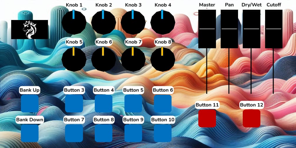
Once the factory has fully loaded, you will see the following screen (without the numbers or colored rectangles):

When starting for the first time, you will also see a welcome window to help you get started quickly. You can move this window by dragging its title, resize it, or close it if you don’t need it.
The factory is divided into six sections. Here’s a glimpse of what they are:
- Design Step Tabs: It’s recommended to start with the “Layout” tab first, then move to the “Customize” tab. While it’s possible to start with customization, you might miss some available options if you do so.
- Design Area: This is where you’ll place selected components and see how your controller will look in the end.
- Available Actions in the Current Step: In the Layout tab, you can specify the controller casing, dimensions, and add components. In the Customize tab, you can personalize the overall look of the controller and its components. More details on this section are explained below.
- Price Summary: Use the “Show/Hide Price Breakdown” button to toggle the details. Hovering over a line will provide an explanation of what that line represents.
- Action Buttons: These buttons are related to your project and the factory itself. The menu button in this section also contains additional actions and settings for the tool.
- Status Bar: Displays information about the last performed action and offers helpful navigation tips/buttons on the right side of the screen.
Did you know?
The factory can work fully offline. Internet connection is only needed if you want to submit your project for production!

On Edge, you can click this icon on the address bar to download the Factor on your computer and use it offline.

On Chrome, you can click this icon on the address bar to download the Factor on your computer and use it offline.
Design Step Tabs
In these tabs (1), you will find buttons relevant to your current step.
The Layout tab allows you to make changes to the appearance of the controller, such as selecting the design, adjusting the size, and adding components or interfaces.
The Customize tab lets you add a personal touch to your controller, such as setting a custom name, logo, and image, as well as customizing individual components.
Design Area
The Design Area (2) is the largest section of the Factory, located on the right side of the screen, where you can view your controller in real-time.
Depending on what’s possible in the current design step, (3) will show available actions what you can perform.
Navigation
The right side of the status bar (6) displays a set of useful information and offers buttons that assist with placement and navigation.
If nothing is selected, you can hold the right mouse button and drag to move around. If you’re lost, use Ctrl + H (on Windows) or Cmd + H (on macOS) to center the view on the controller. You can also click the Center View button on the right side of the status bar for the same result.
The current zoom factor is displayed on the status bar. Use the mouse wheel to zoom in (wheel up) or zoom out (wheel down). Alternatively, you can use the + and – buttons on the right side of the status bar. Clicking Reset will return the zoom to its default value.
The bar also shows the current position of the mouse relative to the controller’s side, making it easier to find the perfect spot for your components.

Grids
Grids are enabled by default to assist you with your layout. Each component can be moved with an accuracy of 0.5 cm. If you wish to toggle the grids, you can do so using Ctrl + G (on Windows) or Cmd + G (on macOS). The snapping to grids will remain always active. You can also access the same action through the Menu… > Show Grids (5).
Layout Tab – Available Options
These are the options available when the Layout tab is active. This tab offers tools to create the exact layout you want for your controller.
Choose Your Design
Under the Layout tab, you can choose your controller design from one of the available options. The selected design will be applied to all sides. Moreover, the top side can be customized with a custom design image, which will replace the default alu-dibond print.
Some important remarks on the designs:
- FSC-certified wood,
- In this design, you cannot change the text colors or set background colors, unless you select a custom design image. In this case the color options will be applied to the top surface.
- Eco-friendly PLAs:
- In this design, no text can be printed. However, you can upload a custom design image in the Customize tab, allowing you to customize both the text and its colors for the top surface.
Set Your Controller Size
MIDILLI controllers can be dimensioned in 5 cm increments. If you have limited space, you can reduce the size down to 10×10 cm. Alternatively, if you prefer a full-sized controller, you can increase the dimensions up to 40×40 cm. To adjust the dimensions, modify the width (horizontal) and length (vertical) parameters, then press the “Update Size” button to confirm the new dimensions.
Important: If you set a smaller size than the current one, some components may be left floating. In that case, you will need to reposition these components manually, and place them with
right-click. More details will be also shown on the status bar.
Add Your Components
MIDILLI Factory offers a variety of components to add into your controller. You can add up to 80 control elements! Even interfaces, inputs, outputs, and screens don’t count toward the component limit.

To add a component, simply click on its category. A popup will appear with a list of available components of that type, along with their prices. Select the component you’d like to add to your controller. When you hover over a component, you’ll also see a brief description of its function.

Once you choose your component, it will follow your mouse. Simply move it around your controller, and right-click to place it. Check the status bar (6) for additional information, such as its current side of the controller as well as its coordinates. Note that the coordinates are based on the center of a component.
You can also rotate a component while moving it, using Ctrl + R (on Windows) or Cmd + R (on macOS).
If a component is red, it cannot be placed due to a collision. The red rectangle around a component indicates the minimum required spacing from other components.

The red rectangle also shows that the component is currently selected.
To remove selected component(s), press Delete key.
Want to add a different component from the same category? Then, press Enter after placing one to open the popup at the location of your cursor. You can also navigate through the available components in the opened popup using the arrow keys on your keyboard.
Right-clicking on a selected component clones it.
To deselect selected component(s), simply right-click anywhere in the design area, except the selected component.
To select a deselected component, use left mouse button. If you select again, you can move the component.
You can also Ctrl + Left-click (on Windows) or Cmd + Left-click (on macOS) on components to add to or remove them from the selection. Alternatively, hold the left mouse button and drag to create a selection rectangle, which will add all touching components to the selection.
Information: Some components have quantity limits. For example, currently, you cannot have more than four (4) MIDI Outputs, or more than one (1) screen. If you see a component grayed out, this might be one of the reasons why it is not possible to add it.
Wireless Interfaces section currently lets you add a Bluetooth interface. It is not listed under interfaces, since it not a physical component on the controller.
Once your layout is ready, click the green button that says: “Done with first steps? Click here to continue.” This will activate the Customize tab.
Customize Tab – Available Options
These are the options available when the Customize tab is active. This tab provides tools to fine-tune your controller, including adding a custom brand name, logo, or design image.

Once your layout is ready, you will find it exciting to have more customization on your controller, as much as we do. Under Global Customization, you will find three options for that:
Set Your Own Branding Name
This is an optional feature that will make the name of your controller appear in the list of devices and within the Digital Audio Workstation (DAW) software you use with the controller. If disabled, “MIDILLI” will be used instead.

If you also enabled the Bluetooth interface, this name will also appear in the device list.
Set Your Own Startup Image
This is an optional feature that will appear on your controller’s display once plugged in, after the MIDILLI logo.


If your controller does not have a screen added, this feature cannot be enabled.
If this feature is disabled, only the MIDILLI logo will be shown.
Click the button “Click to select an image…” to open a file dialog and choose an image file from your computer for your logo. You can upload PNG, JPG, or SVG images.
Depending on the screen size and color, your image may need to be resized, stretched, or converted. To avoid unnatural stretching, we recommend using a logo that closely matches the screen size. If adjustments are necessary, the MIDILLI Image Editor window will open to help you fine-tune the image:

In this window, you can preview how your final image will appear on the display. The editor also lets you adjust the Pixel Threshold for fine-tuning your image. On monochrome displays, you can invert the pixel colors to see if you prefer that style. Feel free to enable this option and check if it looks better on your logo.
Depending on your logo, you may consider changing the Image Scaling option to see which one fits best. You can select one of the following:
- Fit, keep aspect ratio: This option scales your image to fit within the display while maintaining its original proportions. If your logo is large, both its width and height will be reduced proportionally to fit without distortion. For example, if it is a square, it will remain square and be centered on the display.
- Stretch: This mode stretches your image to completely fill the screen. The image will match both the display width and height, which may distort its original shape.
- Shrink height: This mode reduces the height of the image to fit the screen while keeping the original width unchanged unless it exceeds the display boundaries.
- Shrink width: Similar to Shrink height, but this option reduces the width instead while keeping the height unchanged, unless it is larger than the display height.
Click OK to confirm your settings, and the display on the controller will be instantly updated with your logo.
If your logo occupies the entire screen, and you also have your Own Controller Name, the name will be displayed separately after a short delay. If you use a smaller logo, both the logo and the name will be displayed together at the same time.
A teaser: This logo will also be shown on the Configurator once you load your controller up. You can also change the duration if you would like to see your logo longer.
If you change your mind and would like to delete the logo, you can click “Delete Startup Image” button. If you want to temporarily hide it, click the “Set Own Startup Image” button again.
Controller Design Image
With the default FSC wood option, you can have text lasered on the controller, positioned above or next to the components. You can also adjust the text size. However, with PLA designs, text printing is currently not possible. To unlock more customization options, like changing the text color, background, and adding rounded corners, you can upload a custom image, replacing the top side of your controller with an aluminum-dibond printed surface. Choose between matte or glossy finishes. This feature is optional, and if not selected, the design selected in the Layout tab will be used instead.
To add a custom image, click “Select Design Image…” and choose “From Library…” to select from our image library, or upload your own by choosing “From Your Device…”. You can upload PNG, JPG, or SVG files. The uploaded file will be resized and stretched to fit the entire top surface, so it’s best to use an image that matches your controller’s dimensions.

Finally, select how you would like to have your surface? Matte or Glossy.
If you change your mind, or would prefer a natural look, you can click “Reset Design Image” to revert it back.
Component Customizations
If you select a single component from the design area, you’ll be presented with several customization options, depending on the component type.
For instance, Potentiometers or Buttons may offer cap options. In such cases, the “Select cap…” button will display the compatible caps for that component. Once you choose a cap, the component’s appearance will update immediately.
Additionally, if text printing is supported (either on FSC Wood or with the Custom Design Image feature), you can modify the name of the component by adjusting the “Visible Name” field. The “Font Size” setting allows you to adjust the text size, with values ranging from 8 to 100 pixels.
Information: If you leave the default names, a number will be automatically added to each component to differentiate them from one another.
Hint: If you click on the up or down arrows where you need to enter a value in a field, and hold and drag your cursor up or down, you can see in real-time how it affects its value. You can try this in fields like Font Size or Corner Detail options.
If colored texts are enabled (via the Custom Design Image feature), you can choose the text color using the “Text Color” button, and adjust the background color using the “Text Background” button. Current colors will be already there. A color picker will appear for you to make your selections once you click the colors.

This picker offers a wide range of options, including selecting a value directly from the Factory window, adjusting transparency (the A value in RGB mode), entering a custom color code, creating your own color palette, and even customizing the color selection shape. Feel free to experiment and explore — you’ll surely find that perfect match and think, “Aha, that’s it!”
Moreover, if background is chosen and if it is not transparent, changing “Corner detail” will create rounded corners to the background to give a more soft look. You can choose a value between 0 and 100.
Another teaser: Although the text you specify here will be printed or engraved, you can always change it later in the Configurator. If your controller has a screen, this text will also be displayed there.
Batch Customization
If you have only one selected component, you can customize it alone. However, sometimes you may need to customize multiple components at the same time to see the whole picture at once.
In that case, you can add multiple components to the selection as mentioned in Add Your Components section.
Some customizations such as changing the caps of all selected components are available only for a single type, e.g., when all selected components are potentiometers or a single type of button. In that case, you can click “Set X caps to…” and choose a cap to apply to all selected components. If you already have some components with a cap, this will not change their caps. To change theirs as well, check the “Include the ones with cap.” checkbox, then choose the cap that you would like to replace with.

Some customizations, such as text options, can be applied to all selected components. In that case, choose the components you’d like the new changes to be applied to and modify them. The changes will take effect immediately.

If you would like to revert all customizations and restore the default settings, click “Reset all customizations…”. After confirmation, all customizations will be reverted to their original settings.
Price Breakdown
To see how the components and customizations affect the price, you can check this section (4). By default, the base price and the total price will be displayed.
The base price is calculated based on the controller dimensions, while the total price includes the grand total of all components and customizations. The last line also shows how many components are included in the entire project.
You can expand the details by clicking “Show Price Breakdown” button.

In the expanded view, you will see in detail how many components of each category are used in the design, as well as their individual contribution to the price. Additionally, the branding costs will be displayed, which include the custom branding name, startup image (startup logo), and custom design image.
Submit Project
Once you have your design, to get your own controller, you need to submit and order it. Check this section to submit your design and order it: Submitting and Ordering
Action Buttons
Once you are happy with your layout and customization, it is time to submit your design. However, if you would like to make adjustments or save your progress, the following options are available under this category (5):
- Clear Project: Resets your current design and allows you to start fresh.
- Submit Project: Finalizes your design and submits it to our servers for further processing.
- Save Project Locally: Saves your design to your device for future editing, without sending anything to our servers.
- Load Project: Opens a previously saved design so you can continue working on it.
- Login/Logout: Sign in to your account for project tracking or sign out. You can also create a MIDILLI Account if you do not have one. The submission to our servers require that you have an account.
- Menu…: Access additional settings and tool options. Under this menu, you will also find:
- Clone/Import Project…: Import and clone public projects or get your own submitted projects to start editing in your workspace. See below for details on how to do it.
- Login/Logout…: Similar to the login/logout button above.
- My MIDILLI Account…: Go to your MIDILLI Account to see and manage your submitted projects, or owned devices. To learn more about My MIDILLI Account, read the respective manual: My MIDILLI Account
- Online Help…: Open this manual.
- Welcome Window…: Intended to give you a quick start with your design and submission.
- About…: Shows the version of the Factory, and your online status.
- Quit…: Asks whether you want to end the Factory, and quits.
- Show Grids: Toggles the visibility of the grids. Also possible to invoke via
Ctrl + G(on Windows) andCmd + G(on macOS).
Clone/Import Project
If a design is public, or unlisted, you can use the device SKU value written in the product page to clone and import the design into your workspace. Alternatively, the link in the description will directly open the factory and clone it.

If you are also owner of the design, you can also clone your previous designs in the same way. The device SKU is also available in the My MIDILLI Account, under Devices tab.
To clone a design or product using a device SKU, select Menu > Clone/Import Project… and enter the SKU in the dialog:

If you have right to clone the project, it will be stored locally on your computer. You can then use Load Project button to load and work on it.
Status Bar
The status bar is located at the bottom of the Factory main window.

The status bar is divided into two sections:
Left Side: Displays useful information about your current action. It shows whether you’re moving a component and lists available shortcuts for various actions.
Right Side: Provides some other information and provides tools for navigation. It shows the cursor’s current position relative to the controller’s sides and displays the number of components on the current side where your curser is on, represented as (C: N), where N is the number of components.
The zoom factor is also shown on the right side. Use the mouse wheel to zoom in (wheel up) or zoom out (wheel down). Alternatively, use the + and – buttons. Clicking Reset restores the default zoom level.
Center View helps when you’ve navigated too far from the controller. It re-centers the camera on the controller. You can also press Ctrl + H (on Windows) or Cmd + H (on macOS) to quickly center the view.
The i button at the bottom right toggles the Info Window, which stores previously shown tips and warning messages. If there are messages inside, the button turns orange, displaying the number of messages. You can also toggle the window using Ctrl + I (on Windows) or Cmd + I (on macOS).
Your question is not answered? Then, feel free to contact us.