
Here is a step-by-step tutorial to create a simple design using the MIDILLI Factory. If you haven’t started the Factory yet, click here to open it in a new tab. This is the design we are going to have at the end:
You can directly jump to a specific step, or follow us through the guide for a step-by-step design. These are the steps:
Close the helper windows: Project Wizard and Welcome Window.
On Layout tab (default), leave the design as Wood FSC and set controller size to 10 x 10 cm. Then press “Update Size”.

Your controller will be resized and will be seen like the one below:

Start by adding the mandatory components.
The controller must have at least one USB-C interface, and the MIDILLI Button to be submitted. USB-C interface is required to power it up as well as for the communication with your device and the controller. MIDILLI Button is a recovery button if something goes wrong with your configuration, or during diagnostics if required to solve the technical issues.
To add an interface, open Interfaces category, then select USB-C Port. The status bar will show that the component is currently being moved.

Move your mouse around the design area and choose a location for the interface. If a component is red or transparent, you cannot place it. The red rectangle around a component must not touch any other component nor the edges of the board. Components also cannot float; they must be placed inside of one of the sides of the board.
As you move your mouse, you will also see the current coordinates and the location of your cursor along with the component count in brackets at the bottom right of the status bar.

Place the USB-C Interface on x: 8.5, y: 1.5 on the back side of the controller by right-clicking. If you accidentally place it in the wrong spot, simply left-click to select it and then move it to the correct position. If the component is unselected, a left-click will select it, and the second left-click will allow you to move it.

To deselect a component, right-click on an empty location anywhere on the design area.
You don’t like the current rotation? Then use Ctrl + R (on Windows) or Cmd + R (on macOS) to rotate the selected component at 90 degrees clockwise.
Similarly, open the Buttons category and place the MIDILLI Button on the back side, at the coordinates x: 7, y: 1.5 cm by right-clicking on that location.
Add control elements
To send MIDI messages from your controller to the other devices, we need to add control elements. Currently, Potentiometers, Faders, and Buttons can be added. In this tutorial, we will add 5 x Potentiometer Simple, and 3 x Push Button with Ring LED (Black Metal).
Open Potentiometers category and select Potentiometer Simple.

Place the first potentiometer at location x: 2, y: 2 with right-click.
This time, instead of re-selecting it from the component list, right-click on the potentiometer again while it’s selected (highlighted with a red rectangle) to clone it.
Place the second potentiometer at location x: 8, y: 2. Repeat cloning and placing it until you have potentiometers added at locations x: 2, y: 5, x: 5, y: 5, and x: 8, y: 5. You will see the final layout after step 4 and you can check it yourself.
Information: The coordinates of the components are based on their centers. To check if a component is in the correct position, move your mouse to its center and verify the coordinate information displayed on the status bar.
Finally, select the Push Button with Ring LED (Black Metal) from the Buttons category and add three buttons to the locations (x, y): (2, 8), (5, 8), and (8, 8). Remember to clone by right-clicking. If you would like to get out of the tutorial and change the button type, you can press Enter and select another type of button as well.

Add screen
Adding a screen is optional, but this will give us more possibilities such as seeing what we are transmitting, or for the customization options we will enable later.
Select OLED (Blue, 0.96” (128×64)) from the Screens category and place it to x: 5, y: 2.
Set customizations
If everything went as planned, you should be seeing the following layout at the current stage:

If you would like to add more elements, interfaces, or custom text you can. If you are happy with the layouting, click the green “Done with first steps? Click here to continue” button on the left side, or directly select the “Customize” tab on the top left to go to the customization step.

Global Customizations are optional customizations that will enhance your experience with your controller.
The first customization option is the Own Branding Name. Enabling the checkbox allows you to customize the device name visible on your DAW software, in the device list – and if you have the Bluetooth interface, in the list of available devices.

Enable it and set a custom name. However, we cannot see it live, until we order the physical device.
The next customization option is the Own Startup Logo. To use that, first, you need to have a logo. We’ve created a simple logo for you, download it by right-clicking and saving it:
If you already have your own logo, you can also use it.
Then, enable “Set Own Startup Image” checkbox and press “Click to select an image…” button. Note that this feature will be disabled if you skipped adding the screen section.

After choosing the downloaded logo, the MIDILLI Image Editor will show up. The logo has been designed to not be used directly, so under “Converted Image,” it will appear entirely black at first.
Since we’ve added a monochrome blue display, the logo must be converted to a monochrome image and resized to fit the display size. Adjust the Pixel Threshold slider to set how you’d like your logo to appear. Moving it one step left from the center position should be enough to reveal your logo. If you’d like, you can also check the Invert Pixels button to view the inverted version. Finally, set Image Scaling to Stretch to fill the screen completely. This is how we adjusted it for the tutorial:

Click “OK” to confirm your adjustments. Your logo will then be visible under customization section, as well as on the display:
Finally, we will set a Controller Design Image.
In this tutorial, we will use one of the images from the library. To start, press “Select Design Image…” and then choose “From Library…”. Select one of the available images and confirm by pressing “Select.” For this example, we’ve chosen: midi-glitch-but-good-one. Leave the “Matte” finish selected or change it to “Glossy” if you like to have a shiny look.
Since the colors of the selected image may not align perfectly with your controller design, we’ve provided two customization options: Text Color and Text Background Color.
These options will allow you to adjust the appearance of the text on your controller, ensuring it complements the overall design.
Instead of changing these options one-by-one, we will create a selection rectangle around the components placed on the main (top) side of the controller, and perform a batch customization:

With the components selected, click the color field next to the “Set text color” text to set the font color, or “Set background color” to set the background color of the texts. In the tutorial, we will only change the background color to white by moving the color circle, all the way to the top-left on color selection window.

Close the color window by left-clicking anywhere and set the corner radius to 25, while the components are still selected. This should be the final result:

It is a good idea to save your design on a regular basis to avoid losses. To save your work use Ctrl + S (on Windows) and Cmd + S (on macOS). You can also use the “Save Project Locally” button on the bottom-left. Give “Tutorial” as the name to your project and save.
To load a previously saved local project, use Ctrl + O (on Windows) or Cmd + O (on macOS) (the letter O like in Open). Loading a project will overwrite your current design.
We have configured the controller, but not the components’ appearance. Selection of caps are mandatory for control elements. You can set the caps one-by-one or using the batch customization we’ve performed earlier. To set caps in batch, you can only have one type of selected objects. For example, only potentiometers, or buttons, but not both.
To customize a single object, left-click as usual to select it. For example, select the Knob 1 and check the area on the left.

“Select cap…” button will list the available caps to choose from. Choose one of them.
“Text Color” and “Text Background” are to set the colors as we mentioned earlier. If you’d like, you can also change the “Font Size”. As you can also see here, the “Corner detail” value and the colors are set to the ones, we’ve set in batch customization.
The “Visible Name” field is new here. This field changes the name that will be printed together with the design image. If you do not have a design image selected, but Wood surface, it will also be printed as you write it. However, currently, printing on plastic surface is experimental and not available in every color.
If the components have their default visible names, the Factory will append a unique number to them. Once you edit the value to something else, they will disappear.
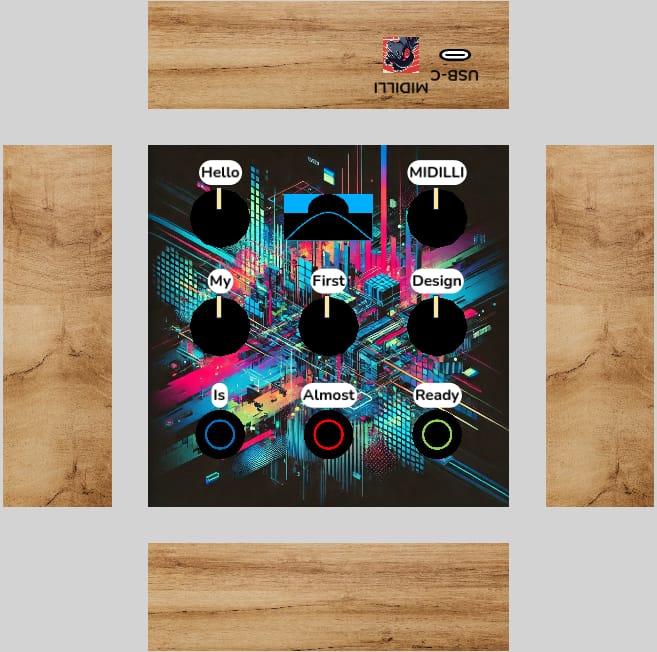
Similar to potentiometers, set the caps and edit the text of the buttons as well. Here is what we designed at the end:

There is more to explain such as adding Bluetooth or other tweaks, but this was the quick tutorial. Continue with the submission as follows.
Submit your design and order your controller
Once you are happy with your design and ready to order your controller, you need to submit it.
The submission process consists of two steps:
- Submit your design to our server.
- Lock your design and create your own product.
After submitting to our server, a copy of your local project will be uploaded, including your logo and design image (if you’ve customized them). To initiate the submission, click on the green “SUBMIT” button located at the bottom-left. Your design will go through an automatic review. If everything seems normal, you will then see the following confirmation dialog:

After pressing “Confirm Submission” it may take a while to submit all data. However, you will be seeing the progress.

After successful submission, you will then be asked if you want to lock your design and continue with payment:

When you select “Finalize Design”, your product will be created, and you’ll be redirected to the product page. On the product page, you can add the controller to your cart or proceed directly to checkout by choosing your preferred payment method. If you choose “Later”, the dialog will close, and you can continue working on your design at any time and “SUBMIT” it again.
Clicking “View My Account” will take you to your MIDILLI Account, where you can view all submitted projects and manage your devices.
Information: After finalizing your design, it will be locked and you will no longer be able to update your design.

After successfully completing the product creation, you’ll see a message confirming it:

You will also receive a short email to the product page.
The “Complete Purchase” button will redirect you to the product page to finalize your payment.
Once we receive your payment, your design will be reviewed and produced! That’s it from your side.
Did we miss anything? Well… Maybe the configuration of your physical controller. However, this will be explained in the Configurator manual.
See the complete Factory manual, or learn more on the Configurator: